Browsershots makes screenshots of your web design in different browsers. It is a free open-source online service created by Johann C. Rocholl. When you submit your web address, it will be added to the job queue. A number of distributed computers will open your website in their browser. Then they will make screenshots and upload them to the central server here.
You can test your site at different resolutions like 800, 1024, 1280, 1400 and 1600. As well as you can test your site at different color depth (like 8,16,24 and 32), different version of Javascript and Flash. http://browsershots.org/
Thursday, December 27, 2007
My online Test Result

Today I visited a usability site. And I just tried to have a usability test. I scored 7 out of 10. I have given wrong answer for three questions. All the three questions were having very close similar answers. Thats why I missed. Anyhow thats my mistake.
Tuesday, December 25, 2007
Free Usability Review
Dear friends,
Send me your website url or web application url. I will give you usability review of your product or site for free.
My usability review will have
1. Usability Issues
2. Usability Suggestions
3. Severity Graph
4. Issue Graph
5. Issue Location Graph
6. Summary Report
Duration of the review will not be more than one week.
Mail me at karthik.unengineer@gmail.com
Friday, December 21, 2007
Wonderful Usability Tools
Screenshot Tool for Firefox
You can take a screenshot or pageshot, draw arrows, type text and make call-outs from within Firefox. This tool will be very useful for Usability Engineer, Usability Tester, Support Engineer and developer
http://screenshot-program.com/fireshot/
Flash Chart
You can create 3D chart images for your applications
http://www.fusioncharts.com/free/
Thursday, December 20, 2007
For monitoring website
I like site24x7.com for their excellent service for website monitoring. It has allowed me to see my website downtimes. It alerts me if my website goes down by sending email. Without login we can analyze a website, DNS lookup, Find IP and location. Every webmaster should use this site.
Tuesday, December 4, 2007
Monday, December 3, 2007
How to use Photoshop Script?
Many people are not familiar with the power of Photoshop Scripts and aren't aware that there are many excellent sample scripts and learning guides included with Photoshop. This tutorial will show you where to find the Photoshop Scripting Guides, show you how to install Photoshop Scripts, and explain how to work with Photoshop Scripts.
So Why Use Scripts Instead Of Actions?
Photoshop Scripts are Actions on steroids, and Scripts can be super smart. From the official Adobe Scripting Guide come these examples of scripting power: You can add conditional logic, so that the script automatically makes "decisions" based on the current situation.
For example, you could write a script that decides which color border to add depending on the size of the selected area in an image: "If the selected area is smaller than 2 x 4 inches, add a green border; otherwise add a red border"
A single script can perform actions that involve multiple applications. For example, you could target both Photoshop CS2 and another Adobe Creative Suite 2 Application in the same script. You can open, save, and rename files using scripts.
Download the documents
For a complete understanding of the power and complexity of scripts read through the Scripting documentation that came with your Photoshop application installation or you can download it from www.adobe.com/devnet/photoshop/pdfs/JavaScriptReferenceGuide.pdf
How to install Photoshop Scripts
After downloading a script you must copy it into your Scripts folder.
On a PC, the path would be: C:\Program Files\Adobe\Photoshop (CS or CS2)\Presets\Scripts\ After copying a script to this folder you'll need to Quit and then Restart Photoshop before the script appears in the File> Scripts menu.
To Run A Photoshop Script
To run a script choose File> Scripts and select the script from the list, which will include any script file that was saved with a .js or .jsx extension and saved in the Presets/Scripts folder. If you want to run a script that was saved in a different location, simply choose File> Scripts> Browse and navigate to the specific script you want to use.
To Set Scripts To Run Automatically
You can have an event such as saving or exporting a file trigger a JavaScript in Photoshop. Here's how: Choose File> Scripts> Scripts Events Manager.
Select Enable Events To Run Scripts/Actions. From the Photoshop Event menu, choose the event that will trigger the script. Select Script and then choose the script to run when the event occurs. The event and its associated script will be listed in the dialog box.
To disable and remove individual events, select the event in the list and click Remove. To disable all events, but keep them in the list, deselect Enable Events To Run Scripts/Actions.
Source
Usability issue in Google Search
If i want to know the latest news/site about "usability" , How can i search it ?
Available Solutions :
1. You can search it as " Latest News + google ".
2. You have to choose the "News" link(Filter) , and then You have to search it.
My proposed Solution :
I need a link as "Latest updates" along with "Web, Images, Groups, News, Scholar".
Available Solutions :
1. You can search it as " Latest News + google ".
2. You have to choose the "News" link(Filter) , and then You have to search it.
My proposed Solution :
I need a link as "Latest updates" along with "Web, Images, Groups, News, Scholar".
Zoho home page is looks cluttered
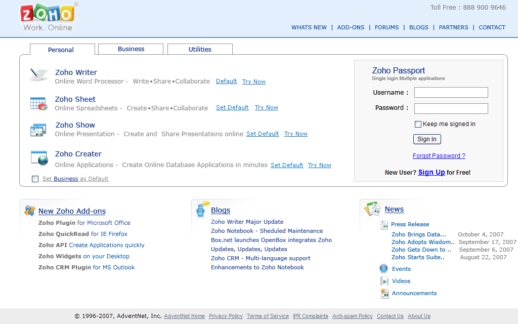
Zoho home page is looks cluttered. They tried to show all of their stuffs but not worry about look and feel. My suggesstion is catagorizing the zoho tools in user's perspective. And It can be done by card sorting method of user testing.
I have done a prototype image for this . This is my perspective only. Look at it and share your thoughts.
Sunday, December 2, 2007
Advanced CSS3
Here you can download a PDF file about advanced concept of CSS3 . It describes the brief history of CSS and advanced CSS3. It may be useful to all developers and designers.
http://www.andybudd.com/presentations/css3/css3.pdf
http://www.andybudd.com/presentations/css3/css3.pdf
Thursday, November 29, 2007
Top 10 Usability Guidelines for Enterprise Applications
Recently I read an articile from Nokia Forums. Its really a must read article for every web application desginers. Here for you..
Provide a clear navigation model
Core features should be available from the main view.
Limit the number of menu choices – make them context specific.
Navigation model should be focused on the user’s main tasks.
Advanced functionality should be hidden from novice users.
Use familiar language
Use terms that are familiar to the user and relates to the users’ tasks and goals.
Terminology should be consistent with the Series 60 UI style.
Localize: target users’ native language should be used.
Hide the complexity of connectivity
Short network coverage problems should not cause loss of users' work or stop them from working.
Connection status should be displayed clearly.
Synchronization should be automatic but under user control.
Provide useful feedback
Let the user know immediately if an action was successful or not.
If processing takes more than 0.5 seconds, indicate that something is happening, for example, with a progress bar.
Be consistent with controls
Minimize errors and the need for learning by using softkeys according to the Series 60 UI style.
Build shortcuts for advanced users, use shortcuts similar to other applications.
Make sure that the most important actions are also available in the Options menu.
Provide a simple Options menu
Navigation key default action(s) should also be available in an Options menu.
Sort items in the Options menu according to the Series 60 UI Style Guide.
Main actions should be available without scrolling.
Use tabs wisely
The most essential functionality should be provided in the first tab. Underlying tabs can be used to hide advanced functionality.
If more than five tabs are needed, use a list for accessing the tabs (see the Settings application).
Text is preferable to icons in tab titles.
Make information entry easy
Instead of text entry, prefer alternative forms of information entry, such as selecting from a list or capturing images.
Offer reasonable default values.
Focus should always be easily movable with the arrow keys.
Display information clearly
Display the most relevant information first.
Essential information should not be displayed with icons only.
Use colors and symbols for highlighting and grouping items.
Provide help
Context-sensitive help should be provided in the application.
Give step-by-step guidance when the user is accomplishing difficult tasks.
More detailed help should be provided on a Web site or in the user guide.
Top Ten Problems with Web Application Usability - by Frank Spillers
Here are some of the top recurring web application usability issues we found from some recent usability research conducted on web applications.
1. Forms that do not auto-populate. Form fields are a typical design element used in registering or searching, for example. (To maximize usability, forms scripting should be programmed correctly to reduce user workload). Forms forcing users to enter redundant information across multiple screens, adds extra effort and may increase process frustration. Forms should also preserve user data across screens in order to adjust data with "Back button" actions.
2. Controls missing consistent logic. Again, scripting forms correctly is important. Dropdown menus that auto-populate a field, such as State/Province, on one page and then do not have the auto-populate function with the same functionality found elsewhere, keep users on their toes (and undermine any perceived usefulness gained from auto-populating).
3. Information requested but not justified. Unnecessary information is perceived as intrusive and annoying, unless rewarded by a motivating gain. Personal information requested or an excessive amount of personal information collected bogs down the process and may be the source of "conversion leakage".
4. Making analysis difficult. Web applications typically provide three main actions: Registration, Add or Create new Data, Review or Change Data.Tables that are hard to interpret or read, interaction that is nested between screens and all "data" and "no information" can reduce the usefulness of the overall application.
5. Failing to offer useful Help. Web applications that require intense studying or involve complex rules or interpretation tend to bog down ease of understanding. Offer a "What is this?" link or describe the purpose of a form in the right hand area (see Yahoo Briefcase sign up process).
6. Forcing lengthy registrations. Registration that requires 8-10 steps will lead to poor registration conversion. Legal agreements do not have to take up multiple pages or multiple pages of text to read.
7. Having unwarned time outs. Ending sessions after 15 minutes without any warning can lead to confusion, anger and annoyance. Offer time out warnings (pop ups).
8. Unhelpful login. Log-in seems to be one of those "necessary evil" on the web. Log-ins that require numeric characters without notice or do not show examples of "username" at log-in are frustrating and can reduce the reuse of a web based application. This goes to say that "forgot your password?" should include any and all log-in screens.
9. Configuring settings and preferences. Forcing users to configure access to a web application without explaining the process involved can add extra effort and increase perceived complexity of the web application.
10. Misrepresenting the user's task with your features. Getting users to jump through hoops to get their work done based on the way you've built the application, not how users want and need it, is probably the single biggest opportunity for improvement.
Note: Specific examples above are taken from research based on Experience Dynamics expert Usability Reviews of web application dashboards including two popular search engine ad applications, two popular web analytics web applications and several email marketing applications.
Subscribe to:
Posts (Atom)