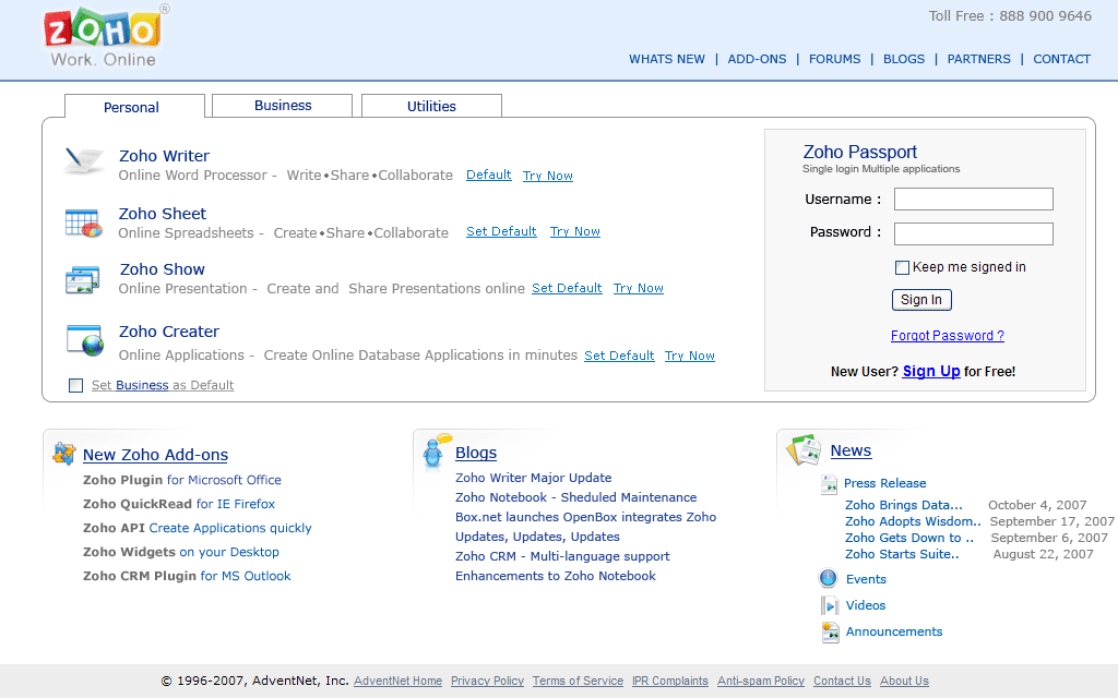
Zoho home page is looks cluttered. They tried to show all of their stuffs but not worry about look and feel. My suggesstion is catagorizing the zoho tools in user's perspective. And It can be done by card sorting method of user testing.
I have done a prototype image for this . This is my perspective only. Look at it and share your thoughts.
No comments:
Post a Comment